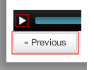
Notice the size of the “Play/Pause” button relative the the “Previous” button (outlined in red). From this it seems obvious that the more important of the two is the “Previous” button. Also notice the close proximity of the two buttons that have very dissimilar actions.
Typically one actually used the “play/pause”button very often and the “Previous” button only on rare occasions. Additionally the “Previous” button does not indicate what it will go back to.
In practice, particularly on an iPad, when one wants to pause the video to consider the content being presented, unless one is very careful one ends canceling out of the current video and being tossed back to the previous video which will start playing. The user will need to pause the video again, carefully not to be sent back even further. When desiring to resume the user will have to click the “Next” button which will cause the desired video to start playing—but at the beginning. Next the user will have to try and find the approximate place where he was when originally attempting to pause the video in-order to resume.
The solution is really simple, separate the two buttons either vertically or horizontally.
The take-away: The UX designer needs to do two things: 1) Actually try a real usage case himself and 2) Have a new user try the UX, without any prompting, and observer. Of course this may require an iteration of the UX.
Perverse as I am, I can’t wait to bring this up in the upcoming “Human-Computer Interaction” course. ![]()

You can display a menu from any screen on your Kindle. When you press the “Menu” button, it displays choices related to the screen you are viewing. The sample screen below shows you the screen you would typically see when you press the “Menu” button from within a book.
Linda,
The device in question is an iPad. The post is neither about a particular device nor how to do something a Kindle. It is about the terrible UI choice that is used to view a UI course.
In general there is to little attention paid to UI/UX.
As for the Kindle, we have a couple and they have major UX issues as if anyone at Amazon cares.
The “Back” button toolbar is extremely useful when it comes to browsing in Internet Explorer or any other browser. The “Back” button lets you go back to a previous page and, when completed with the “Forward” button, the toolbar also helps you advance to the next page. Malware or spyware infections are some of the many reasons why the back button may suddenly disappear from your Internet Explorer toolbar.